Design a concert merchandise app for your favorite band - Mobile


Project overview
The product:
We created an app to help people navigate through the ordering process for concert merchandise of their favorite band. The app makes it possible for users to complete the ordering process as quickly and efficiently as possible. Target users are working adults who want to go through the ordering process as quickly and efficiently as possible.
Project duration:
March 2022 to September 2022
The problem:
We want to determine if users have difficulty navigating product information, such as reviews, zoom-in capability of product photos, ordering and payment process, and how to address those issues.
The goal:
Determine if users are able to go from point A to point B, in a timely manner, when going through the ordering process. If users have difficulty in the process of browsing concert merchandise and ordering, I will adjust the design accordingly.
My role:
My role for this project was lead UX designer and UX researcher.
Responsibilities:
My responsibilities throughout the project included, planning and conducting user research, competitor analysis, personas, storyboards, information architecture, sitemaps, wireframing, prototyping, and conducting usability testing.
Understanding the user
User research: summary
I conducted interviews and created empathy maps to understand the users I designed for and their needs. A primary user group I was able to identify through research, was working adults who want the ability to go through the ordering process as quickly and efficiently as possible.
This user group confirmed initial assumptions about ABC customers, but research also revealed that going through the ordering process as quickly and efficiently as possible, was not the only factor limiting users from making a purchase. Other user problems included, access to accurate reviews, and the ability to zoom-in on a product to see the quality of the product.
User research: pain points
Pain point: Accurate reviews
This pain point will guide designs moving forward by, providing users with the ability to confirm they’re reading verified reviews.
Pain point: Zoom-in capability
This pain point will guide designs moving forward by, providing users with a way to zoom-in and see the quality and details of a product.
Pain point: Enter discount/coupon
This pain point will guide designs moving forward by, providing users with a clear indication on where to enter discount/coupon codes, saving them money.
Pain point: Quick checkout process
This pain point will guide designs moving forward by, providing users with the ability to go through the ordering process as quickly and efficiently as possible.
Persona: Walter
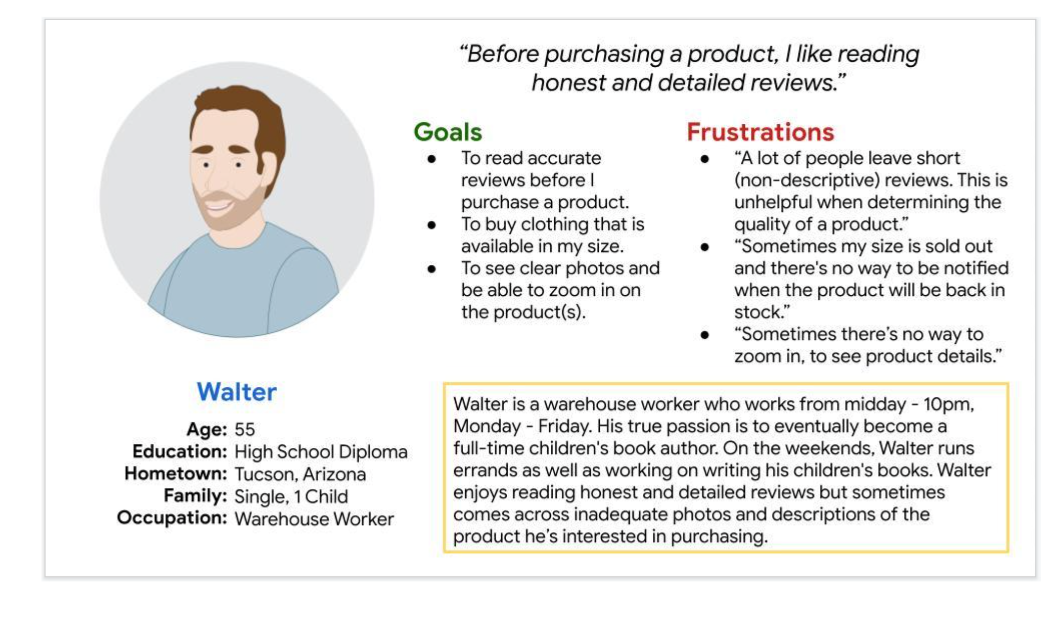
Problem statement:
Walter is a single, working father who writes in his spare time who needs a way to read detailed information about a product he’s interested in because the quality of a product is an important factor before making a purchase.
User journey map
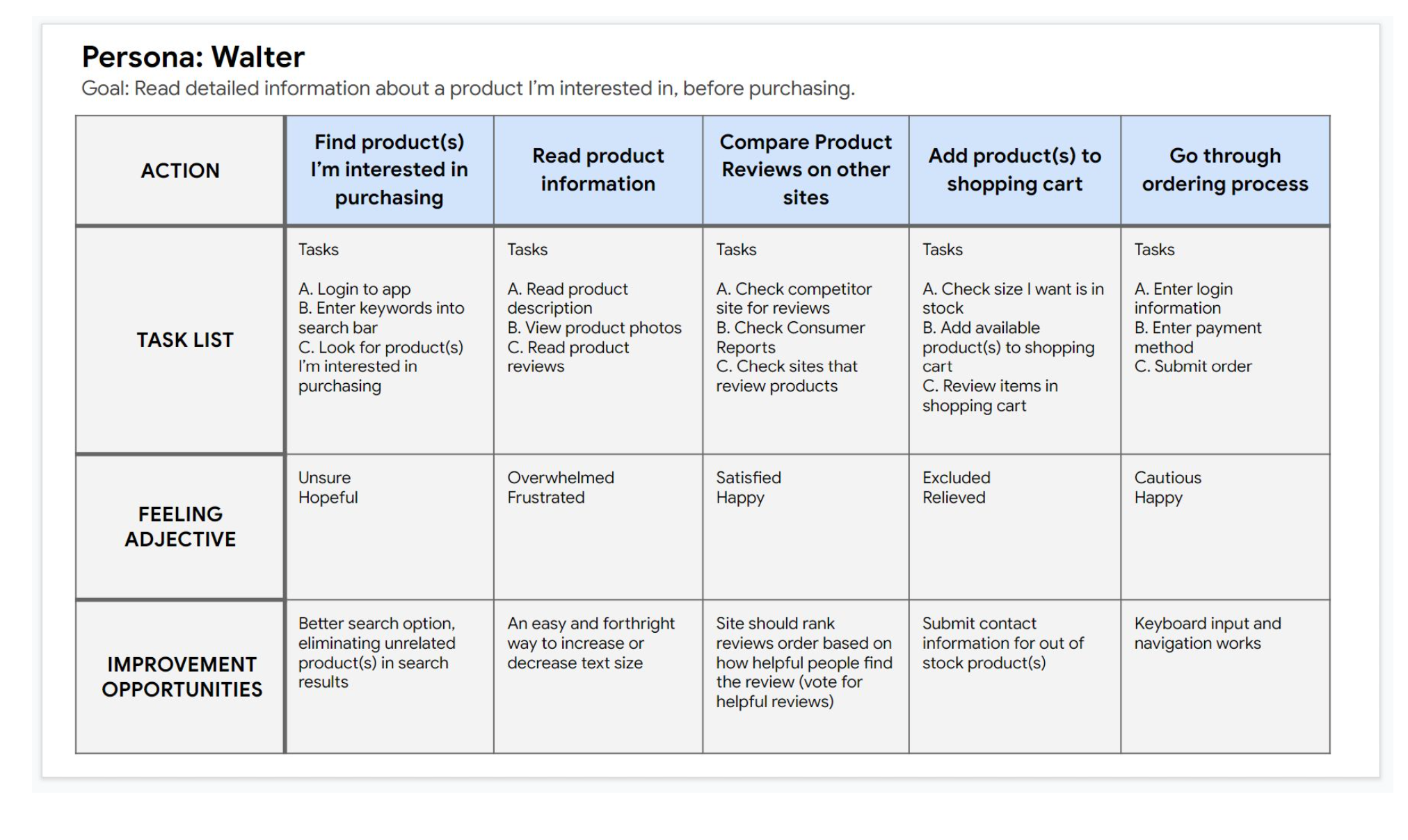
My goal is to make it where users go through the ordering process as quickly and efficiently as possible. I also want to provide users a simple way of navigating back to previous pages, where needed.
Starting the design
Paper wireframes
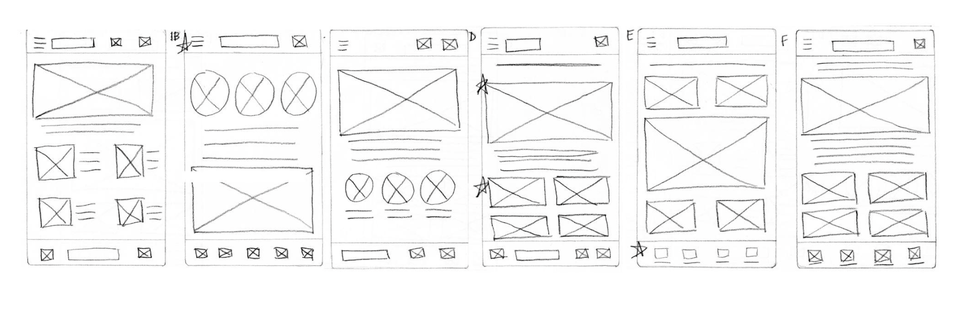
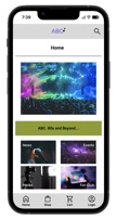
I wanted to have the home page to hold the users interest but not be too busy, visually.
I originally drew the menu button at the top left of the app screen but later, decided to remove it and leave the menu tabs along the bottom of the screen.
Digital wireframes
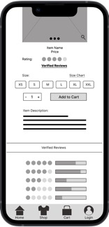
I knew I needed to address the need for users to have a way to zoom-in to see product detail.
I also knew it was important for users to be able to read reviews for products from actual customers who purchased the item(s).
 .
. 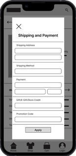
I knew I needed to address the users need to get through the ordering process as quickly and efficiently as possible.
One area users were concerned with was not having a clear idea on where to enter a gift card, store credit and/or a promotion code.
Low-fidelity prototype
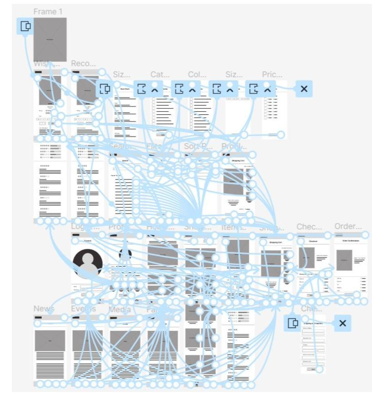
The low-fidelity prototype connected the main user flow of browsing band merchandise and going through the ordering process, so the prototype could be used in a usability study with users.
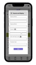
On the overlay screen, users are able to easily enter payment information, as well as, a gift card, store credit and/or a promotion code.
Underneath the overlay, there’s an arrow button to access shipping, payment, and other payment information.
ABC low-fidelity prototype
Usability study: findings
I conducted two rounds of usability studies. Findings from the first study helped guide the designs from wireframes to mockups. The second study used a high-fidelity prototype and revealed what aspects of the mockups needed refining.
Round 1 findings
Users want to know where to zoom in on a product.
Users want to know where to look to shop for merchandise.
Users want to have easy access to verified reviews.
Round 2 findings
Verified reviews was found after a little difficulty by some users.
The wording of Prompt 4 seemed confusing to some users.
There is confusion by one user on where to click to access payment.
Refining the design
Mockups
Before usability studies:____After usability studies:
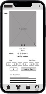 ________
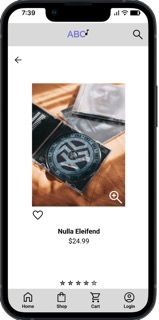
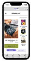
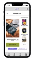
My goal was to make the zoom-in feature more noticeable. It seemed some users were confused by the search icon and zoom-in icon appearing the same. One user suggested adding words near the zoom-in icon. Ultimately, I decided to use the zoom-in icon for this feature. By doing so, users easily identified how to zoom-in on merchandise image.
My goal was to make it easy for users to find and access payment information. It seemed some users were distracted by excess text. I also noted that one user tried clicking on the words, “Shipping, Payment, E-Gift,...” instead of the forward arrow button. I simplified the words to “Payment and Shipping” and made them clickable, along with the forward arrow button.
Before usability study 2.: ___After usability study 2:
 .________
High-fidelity prototype
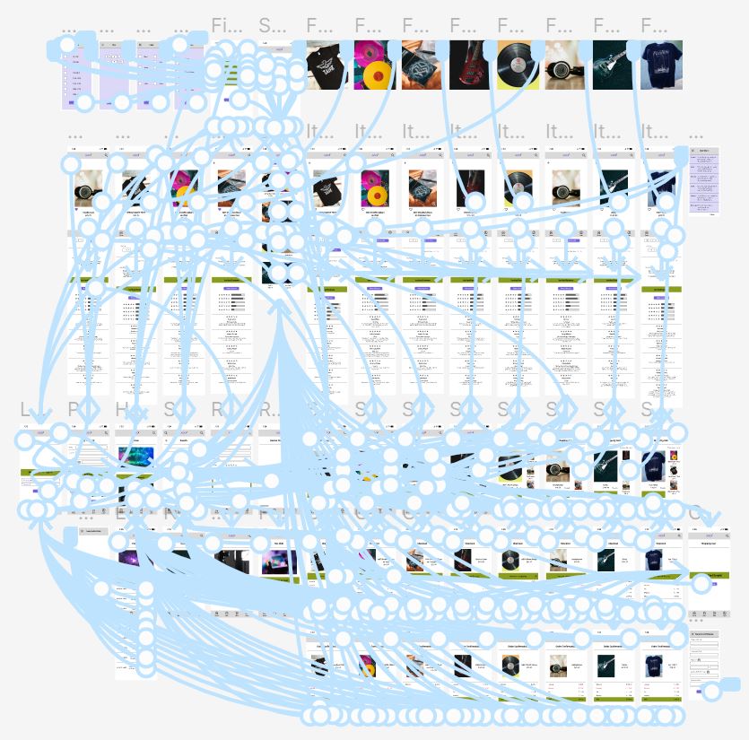
The high-fidelity prototype presented a smooth user flow for browsing band merchandise and completing the ordering process in a quick and efficient manner. It also met user needs concerning confirmed verified reviews, zoom-in photo feature, and entering payment and discount code information.
ABC high-fidelity prototype
Accessibility considerations
I had to figure out a way to make the zoom-in feature accessible and did so by adding a zoom-in icon with a plus symbol in the middle of it. By having this icon, it made it clear to users, that by hovering over this icon, they could see a zoomed-in image of the product.
I decided to add a feature which would allow users to adjust the font size on the item page(s), from small to large and vice versa. I also adjusted the font size and text color throughout the design pages, in order to make it easier for users to focus on information of greater importance.
When creating animations, such as page overlays, I adjusted where they rested. I did this so users would be less likely to become concerned about accidentally clicking a button underneath the overlay, leading them to an action they were not ready to make, or hadn’t planned on making.
Going forward
Takeaways
Impact:
"Well, it was easy to find the method or what to click, to get where you wanted to go."
Participant C
What I learned:
Some of the things I learned throughout the project were that there are many people familiar with accessing websites on a desktop or laptop computer but have very little experience doing so on a smartphone. I dug deep and put myself in the position of using something for the first time, which opened my eyes to challenges these users would face.
Next steps:
I plan to make words and icons that are related to one another, clickable. I will do this because some participants in my usability study tried clicking on words, instead of their corresponding icon. By making the words and icons clickable, the user with take less time to complete a task.
The way in which one task prompt was worded, confused some users. I plan to be more mindful of how I word task prompts because some participants might not be comfortable expressing their confusion, which could negatively affect the results of a usability study.
I plan to simplify wording in certain sections of my app design because some participants did not notice some important key elements on the page(s), such as, verified reviews. Having a less busy page would make it where users can focus better on what is more important during the user journey.
Let’s connect!
Thank you for your time reviewing my work on the ABC concert merchandise app! If you’d like to see more or get in touch, my contact information is provided below.
Contact Suzanne Carlson
Thank you!